Showing posts with label card making. Show all posts

Wednesday, 6 May 2026

Anyone for a Visible Image ice cream?

It’s time for my fortnightly design team make for Visible Image. These are usually shared over on my Instagram account, along with step-by-step photos, but I’ve had a few requests recently from those who don’t use Instagram to share the occasional blog post instead—so here we are!

My brief for this make was to use a stencil and build up layers, which is always a technique I enjoy. This time, I created a fun, summery birthday card using the delightful Better with Ice Cream stamp set. I also incorporated the Atmospheric stencil, added background stamping with Grunge Tones, and used the ever-versatile Broken mesh Layering Die. The birthday sentiment comes from the Birthday Wishes set.

Step-by-Step Process

I started with a piece of Distress Spray Stain background from my stash.

I cut it down to 4½" x 6½". Using Worn Lipstick Distress Ink, I applied colour through the Atmospheric stencil, placing it in random areas to create a soft, layered effect.


To build more depth, I stamped randomly over the background using the Grunge Tones set with these 2 colours of Versafine Clair ink, continuing until I was happy with the overall look.


Next came the focal elements—the ice creams! This set includes two fabulous styles: a waffle cone and a classic Mr Whippy-style swirl.

 I stamped the cones using Acorn Versafine onto kraft card (or the inside of cereal packaging if you don’t have kraft to hand—such a handy tip!). The ice cream tops were stamped in red and brown onto white card, creating realistic strawberry and chocolate scoops.


After fussy cutting all the elements, I assembled the cones and added a flake to the Mr whippy style to create a classic “99”—such a fun detail!

For extra texture, I used the Mesh Layering Die, cutting it from white card and trimming it into pieces to adhere around the edges of the background.

The birthday sentiment was created by combining a greeting from the Birthday Wishes set with one from the ice cream set, stamped onto white card. 


Finally, I assembled the whole design, mounting it onto black card and then onto a white card blank.

Final Touches

To finish, I added a few of my trademark sequins for a little sparkle.

 Thank you so much for visiting today—I hope you found this tutorial helpful and maybe even a little inspiring to make your own fun ice cream cards. 

Here is my card once more with a close up of the focal. 


Remember that most of my creative makes are shared over on Instagram (linked here and in my sidebar), so feel free to pop over and follow along there too.

Back soon…(I have my new STAMPlorations Design Team post coming up this afternoon. A busy blog day!)

Bye for now!

Jane x


Saturday, 17 May 2025

More inspiration for our Country View crafts May challenge

  Hi everyone I am here today with my 2nd design team make to hopefully inspire you to join our May challenge. The theme this month is to share your projects which are " aged, weathered, distressed or timeworn." You don't need a blog or an Instagram account, just head over to the group and join in with the fun! The link is Here and if you are not already a member just request to join and we will warmly welcome you. It is also be a place you can be the first to hear about workshops, the latest releases etc etc. We have a happy membership of over 380 crafters and we are growing every day. You can enter the challenges up to 5 times as you like as long as you use products from brands which are stocked on the Country View Website.

I made this aged/distressed card using all Tim Holtz products. 


And this is how I  made it;
I used kitsch flamingo and saltwater taffy distress sprays to make a background. 


Plus a little stencilling using mustard seed distress ink and one of Tim' stencils. 


I then added some background stamping using the Field notes stamp set. 


I  gathered some Tim ephemera and a butterfly I made using the detailed butterfly die with some sterling foundry wax on the edges. 


I also used a stamp from the stamp sticker book and some of Tim's fab cello sticker tape to add to the aged/timeworn feel. 


I put my design together and finished off my card. 

Here it is once more 

with a couple of close ups;


and 1 final shot


I have linked to products available on the website in my post. If they are not in stock just email Susan, who should be able to order them in for you. 

Remember that you can find me most days over on Instagram Here @jane.tyrrell where I share many, many more makes then I have the time to blog.

I hope I may have inspired you to give our May challenge a go. There is a  fab prize up for grabs too for one randomly selected and you can enter up to 5 times. 

Bye for now,

Jane x

Wednesday, 20 November 2024

Winter wedding inspiration for Visible Image

Hi everyone, and welcome to my latest design team make for Visible Image. The theme for our makes this week is "winter weddings". I always think that the idea of having a winter wedding is very special. My immediate thoughts for a colour scheme were Kraft with white, gold and a pop of red. This is colour scheme I love to use for Christmas cards too. 

There is a gorgeous wedding verse set by VI and I knew this would be perfect to use as the focal of my card. There are 2 stamps in this set and you could just put "on your wedding day" on the front of the card and put the verse inside.

 This is my winter wedding card.


The the verse set I used was 


I also used the Grunge flourish  stamp


Here is my step by step tutorial. 

First I stamped wedding sentiment and verse onto kraft card using Versafine Morning mist ink. 


Next I stamped the lilies with love image a couple of times onto smooth white card using embossing ink and gold heat embossed them. I cut them out using their co ordinating dies and also cut out by hand a few pieces of the leaves left behind. Don't worry that they have some parts cut away. They can be tucked away underneath the flowers. 


I cut out the verse using a rectangular stitched edge die from my stash  (but of course you can just cut this out by hand). 


I also ran some white ink around the edges of the plaque. 
Using embossing ink and white embossing powder I repeat stamped the Grunge flourish around the edges of a piece of  5 1/2" square Kraft  card. 


I then added the focal plaque to the centre, raising it up a little with foam 3D pads. 


I arranged the die cut lilies and leaves around the edges. I stuck them in place using a mix of glue and foam pads to give them some dimension. 


I added some finishing touches of my trademark sequins and 3 red gem hearts for a pop of winter colour. I then adhered it to a 5 3/4" white square card blank. 


Here's a close up


and 1 final shot.


Of course this design doesn't have to be just for a winter wedding card.  If you put a different sentiment or verse on the focal plaque it would also work for a winter birthday, or even a Christmas card.

 All the Visible Image links are listed below;

 Our kind, friendly and supportive customer Facebook Group is here ...it would be lovely to see you join us.  You will be warmly welcomed and see lots of inspiration from the DT and customers to inspire your own creativity. 
 I also organize a monthly artist trading card swap in the group. Whether you are a new stamper or a seasoned one you are most welcome to join us. Over 150 members, worldwide, have taken part since it started over 3 years ago. It's been such fun and it's so lovely to receive a unique piece of art from your partner in the post. The details and sign up for each swap are posted in the group on the 23rd of the month. There is no "monthly" commitment, just join in when you have the time and if you live in the UK can you choose to post to the UK only if that suits you best.

The main Visible Image Facebook business page is here

Their website is here

Visible Image also has its own You Tube channel here where you can see videos and Lives to give you lots of inspiration and ideas. 

Their Instagram page can be found here 

Back soon,

Bye for now,


Jane x

Wednesday, 30 October 2024

Crafting tricks and treats from Visible Image

Hi everyone today I am taking part in a "tricks and treats" feature over on the Visible Image blog. Myself and some of my fellow design team members are sharing lots of crafting "tricks" (hacks or tips) and some crafting "treats" with ideas to help you take your crafting to a different level. I came up with an idea of showing how an identical card design can look so different just using additional techniques. One card is a simple mixed media make, the second has a few more "treats" added. I even have a third card which uses the left overs. To make this post easy to refer to I have added all the "tricks" or "treats" in bold type as I take you through my step by step tutorial showing how all 3 cards were made

As it is autumn and nearly Halloween I kept to this theme when I chose my stamps and ink colours but you could use any stamp set and any colours. Below are the 3 cards I made, 2 with the identical leaf design and sentiment and a Halloween card I made with a leaf "left over".

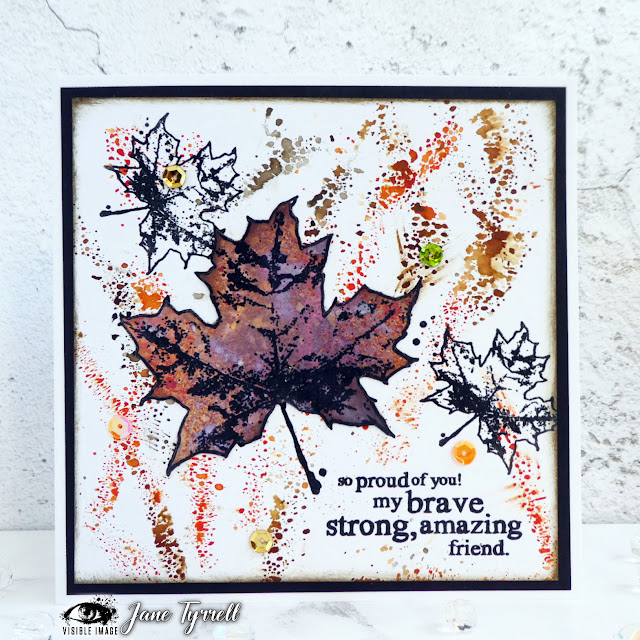
The leaf friendship cards were made using the lovely Erika's Maple set

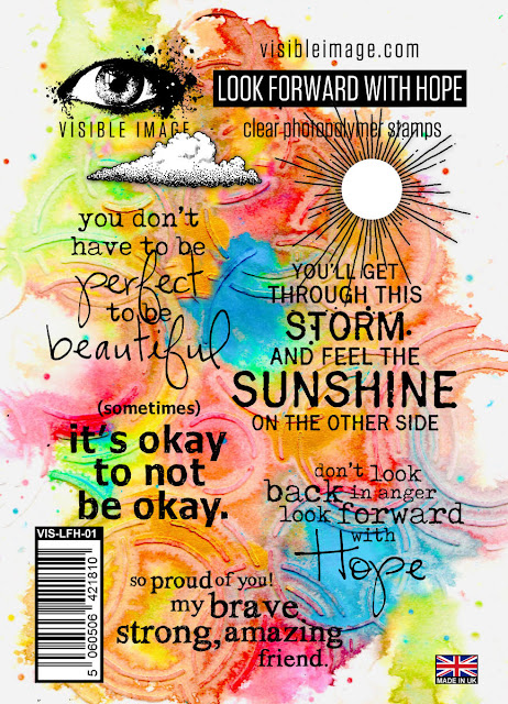
 with a sentiment from the Look forward with hope stamp set.
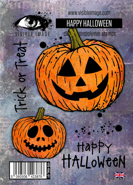
 The Halloween card was made using the awesome Happy Halloween set.
To make things simpler I have numbered the 2 leaf friendship cards,

Card 1
and Card 2 


This is how they came together;  

I used 300gsm Pink Frog smooth white card to make card 1 and Daylor Rowney 250gsm mixed media card for card 2. These are my personal preferences for stamping. 

Trick; You need to use smooth cardstock or the smoother side of mixed media card to get a clear stamped image. As long as your card can take water you can mix and match. You can use using thinner card but you need to try it out. Over the years I have found my own favourites and some are very cheap card. Don't be afraid to try different types and brands and find your own personal preferences. 


First I stamped my design onto each piece of card. I stamped 2 small leaves and the sentiment first. 

Trick; the ink you use for stamping is also important if you want a clear crisp impression. Pigment inks are best but take time to dry. My go to stamping ink is Versafine Clair. I used Nocturne for these cards. 
Treat; try clear heat embossing your stamped image. It provides a smooth shiny and clear surface which also resists any extra inks added. I would also recommend using super fine clear powder particularly for heat embossing sentiments. 


This is the stamped leaf design.

Tip; As I chose to  decoupage the middle leaf using a cut out one on top it does not matter if your stamping overlaps. This eliminates the need to mask, which personally, is a technique I rarely use.  


I then chose these 3 autumnal inspired distress ink colours.


For card one I pressed a little of each ink piece of acetate.

Tip; use the clear carrier sheet that your stamps are attached to. 

Spritz on a little water until droplets form.


Then press over several areas of the background. 

Trick; to avoid smudging the wet ink use a heat gun to carefully dry your background (or just leave to air dry).
Treat; there is a big difference between a heat tool and an embossing gun. If you want to take your crafting to the next level it is worth investing in both. Although both give out the same heat a heat gun diffuses its heat and does not move the inks. An embossing gun has a very concentrated point for heating, designed to melt embossing powders. If you use an embossing gun to dry inks over an area where an image has already been heat embossed you risk melting the existing embossing. 


Next I went through my stash of  backgrounds made using book pages and distress inks to find something suitable for "decoupaging" my large leaf. I chose these 2. I stamped a few of the large leaves and cut them out.
Trick; store any spares you don't use with the stamp set. They are then ready made for your next autumn leaves project.


Because I had already stamped the large leaf on the card I didn't need the stalk, so I cut them off. 

Trick; when fussy cutting try to move the card not the scissors. 


Trick; have a background making session occasionally so that you always have something ready for when you want to create. It is important that that inks are dry too so is this super useful and a time saver. 

Treat; I love using book pages to stamp on. They add a lovely extra "vintage" twist to mixed media makes.  But always ensure you read the text so that there is nothing embarrassing when you adhere them to your projects! I have an old copy of "The tale of 2 cities" my Hb gave me years ago. Sticking the pages onto thin paper also helps to give them some extra body.
 
I then adhered a leaf onto card 1.


and finished off with a few sequins.

Treat; adding a few sequins or gems are great finishing touches for your card making. Think about their placement before you stick them down. You might need to re arrange for the best effect


For card 2  I added the same 3 inks but used a circular blending tool for their application. 

Trick; the newer more domed blending tools make ink blending much easier. If you find using regular distress inks hard to blend (it does just take practice) try the oxide version, which are easier. However, personally, I like the vibrancy and translucency of regular distress inks. 


Treat; add a few spritzes  of water to the background and blot off with paper towel. It removes some of the ink and gives a very interesting bleached effect and also mixes the inks a little.


 1 added a large leaf over the stamped one in the same way as card 1. 

Treats; put a small piece of foam pad under the top of the leaf to raise it slightly and add some drops of glossy accents for some more finishing touches. These treats give more dimension to your card.


For both cards I matted onto black card and then a white card blank.

Trick; using a black card matt makes the cards "pop". (Dark red and dark colours will also work well). Inking the edges with a dark ink and even distressing (see card 2) using a distress tool or blade of your scissors all add extra interest and texture.

Treat; try to be accurate when you mat and mount your cards. Cards which are "wonky" detract from all your hard work. Use premium card blanks too if you would like to "elevate" your card making. Flimsy cards fall over and bend. 

Here are both finished cards together.


So what did I do with one of the spare leaves...well of course I had to make a quick and simple Trick or Treat card didn't I!

I used black card for the background. I cut the leaf out with its stalk intact this time.


I found a ready made pumpkin left over from a previous project and simply stuck him under the edge of the leaf, added some white dots using the stamp in the set and picket fence distress ink. I then stamped and heat embossed  the sentiment using sparkly white embossing powder.


And in a few minutes I had an extra card....

Trick; use an antistatic bag if you are using glittery embossing powders on black card. It stops all those stray flecks of powder sticking, which can spoil a finished card. 


I really hope you enjoyed my crafting tricks and treats in this post. I am hoping that, particularly for new paper crafters, they might encourage you to try some new techniques. For those seasoned card makers  out there I hope you might also have enjoyed a few treats here today.  
If you have any crafting questions that you would find useful to be answered in similar posts please let us know. 

Enjoy your Halloween....and make sure you have enough treats for the Trick or Treaters...boo to you!!

I will be back with my "usual" design team post on 4th November. It's a children theme and I have something very different to share.

Bye for now,


Jane x